Most study apps have the same flaw: they need you to remember they exist. You have to close TikTok, open the study app, and choose to review — three decisions in a row, at the exact moment your willpower is lowest.
Icarus skips the first two. It locks the apps you actually open too much, and when you try to open them, it asks you a few questions pulled from your own notes before it lets you through. I started it with two co-founders, Simpson Lin and Ian Prazak, who ran the business and financial side while I led product and design. Both stepped away mid-build, and I carried it through App Store launch and everything after alone.
The problem, measured
I didn't have to guess how bad this was — I measured it once the beta was running: 30 to 40 phone unlocks per user per day. That number is what convinced me an interruption was worth building at all.
Everyone I talked to had already tried something:
- Screen Time limits — tapped through, every time.
- Focus timers — nothing actually stops the app from opening.
- Deleting the app — reinstalled within the week.
All three ask for willpower at the exact moment willpower has already lost. The bet behind Icarus was to replace a dismissable barrier with a cost that's small, immediate, and productive: answer a few questions on your own coursework to get back in. Cheap enough that people keep the app installed, expensive enough to actually break the impulse.
This only works for students specifically, not distracted people generally — they have material worth quizzing on, deadlines that create real urgency, and I can reach them for free through campuses. A knowledge worker has the same scrolling problem but no shared content to gate the app behind, so the mechanic doesn't transfer yet.
The mechanic I was sure about, and the one that won
Before locking in a design, I ran two different unlock mechanics on the MVP and put both in front of 30 participants, scoring two things: did they actually learn anything, and would they still reach for their phone anyway.
Time banking — study first, earn minutes, bank them, spend them whenever — tested best in interviews. People liked the idea of control over their own balance.
Fixed session — a flat 10 minutes and a set number of questions, answer now, no balance to manage — is what shipped.
In practice, time banking broke the moment it became bankable. Participants guessed answers as fast as possible to farm minutes, learned nothing, and chased an infinite balance instead of actually reviewing. What people said they wanted and what they did under real use split cleanly, so I cut time banking rather than tuning it — the earn rate wasn't the problem, the incentive was pointed the wrong way from the start.
How it actually works
- Upload your materials. Notes, slides, past tests — typed or handwritten on iPad with Apple Pencil support. Icarus turns them into short AI-generated review questions.
- Set a distraction level. Higher difficulty means more questions stand between you and the app.
- Answer or walk away. When a locked app pops the check, you either work through a few questions from your own material or close it and go study instead.
- Re-lock. The app only stays open for a set window before the next round of questions.
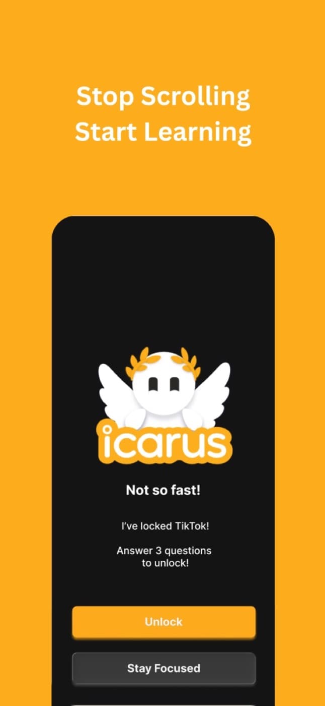
That's the whole mechanic. No timers to outlast, no tree that dies if you give up. Either you decide the questions aren't worth it and you close the app, or you get a little more review in before you scroll anyway.
Apple ruled out the original design
The first version put the knowledge check directly on the system block screen: open TikTok, answer three questions right there, unlock. Apple's Family Controls and DeviceActivity frameworks don't allow custom interactive content on that screen — you get the shield, not the canvas. No quiz, no answer handling, no unlock logic inside it. That premise was dead on arrival, and I found out mid-build.
What shipped instead: the shield fires a notification, which deep-links into Icarus, where the knowledge check runs in-app, and unlocking happens from there. One extra hop, but the check now happens somewhere I actually own the interface. The entire 10-step onboarding sequence — goal selection, a diagnostic quiz, guided permissions, an interactive demo — got rescoped around that pipeline, because nothing in the app can block anything until the user has granted Screen Time and notification access. That made onboarding the highest-stakes screen in the product, and I got the order wrong twice before it made sense.
Three tries before onboarding worked
I instrumented onboarding, retention, and session-depth funnels in PostHog and split cold App Store installs from warm leads who already understood the pitch going in. Warm leads finished onboarding at a near-ceiling rate in every version, which is exactly what hid the real problem from me at first.
Looking at cold installs only:
- V1 — 40% completion. A static screen telling the user what the app could do. Nothing after it showed what that actually got them.
- V2 — 70% completion. Swapped the description for a demo — except the demo used a fake stand-in question instead of a real one, so the user still never saw the thing work.
- V3 — 95% completion. A real question against a real locked app, run before anything is asked of the user. Nothing simulated.
V3 could finally run a genuine microsession because the diagnostic step pulls from a community question library I imported from OpenStax's open-source textbooks — so even a brand-new free user has real content to answer on day one, not a placeholder. V3 also moved the permission prompts to after the user had already seen the app work, and explained exactly why each one was needed: Screen Time to detect the app opening, notifications to bring the user back into Icarus to clear the check.
I can't call these exact rates — the cohorts run from n=8 to n=32, which is a trend, not a statistic — but the direction across all three versions, plus the session recordings, was unambiguous.
From Greek myth to a monogram
The name came before the visual identity did, and the first attempt at a look took the name very literally. Early concepts leaned all the way into the myth — wings, a sunburst, gold gradients, an angel falling toward the ground on the splash screen. It read as an anime app, not a study tool someone would trust with their focus.
So the identity got stripped down to a monogram: a serif "J" (Icarus's mark reads as a stylized J, from the shape of the wing in the original sketch) inside a plain ring, gray or white on black. No gradient, no mascot, no wings.
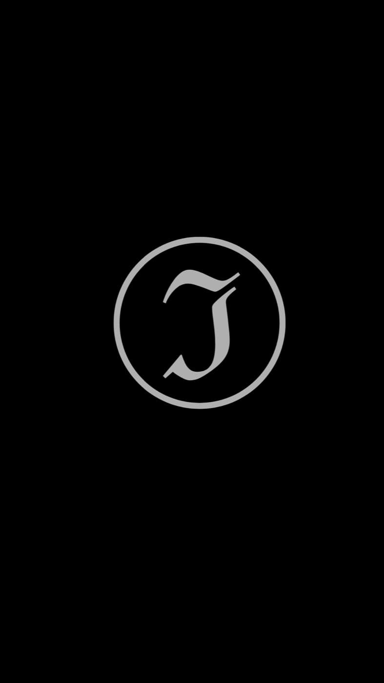

Whoop's icon is the same formula — a monogram, a ring, nothing else — and it's the reference I kept open while I worked. The letterform sits a little high in the circle rather than dead center, which reads as more considered than centering it exactly would. That top-weighted balance, plus a serif instead of the rounded sans most habit apps default to, was the whole trick to making a locking app feel less like a punishment and more like a piece of equipment.

The monogram tested fine and felt lifeless
The problem with the monogram didn't show up until real users had it in their hands. It read as premium in a design review and cold in an onboarding flow. People said the app felt lifeless — which is a rough thing to hear about a product whose whole job is to talk you out of doomscrolling several times a day.
So I looked at what education apps that actually get opened daily were doing differently. Duolingo and Brilliant both lean hard on a character instead of a mark, and it's not just decoration — a face gives an app something to react with you, which a ring and a letterform can't do. Icarus needed that more than it needed to look serious.
Getting the mascot's face right
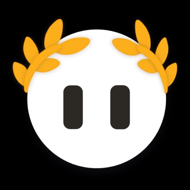
The mascot went through a real ideation pass, not a single AI generation kept as-is: reference boards, generated concepts, and hand sketches to work out proportions before anything got finalized in Figma. Most of that iteration came down to the eyes, because on a character this simple, the eyes are almost the entire performance.
The earliest version had no eyes at all, which read as unsettling rather than serene. Giving it plain circular eyes fixed one problem and created another — at this scale, two black circles on a white sphere reads as a skull, not a face. Detailed, pupil-and-highlight eyes swung too far the other way, landing somewhere in the uncanny valley against such a simple body. What actually worked was the plainest option on paper: two solid, rounded pill shapes. Softer than circles, expressive enough to read calm or attentive depending on how they're posed, and simple enough not to fight the rest of the character. When I put versions in front of users, the pill-eyed version was the one people consistently called friendlier and more approachable.
That same character is built out as a Rive file in the actual app rather than a static image, so it can hold different poses across onboarding, locking, and unlocking states instead of being one frozen icon.
What beta actually showed
Once people got in, the numbers from the first three weeks told me more than the interviews had:
- 30–40 unlocks per user, per day. The interception fires constantly, so small changes to the cost of unlocking compound fast.
- 3 apps blocked per user, on average. People target a short list of specific habits, not everything on their phone.
- 70 study hours logged, cumulative across the beta cohort — hours that exist only because an app got locked first.
That pattern — a handful of targeted apps, dozens of touches a day — told me people are using Icarus as a habit interrupter, not a lockdown tool, which is exactly what the fixed-session mechanic was built for. It also sets a ceiling on how hard I can make any single check: at that frequency, a long question set is a reason to uninstall, so difficulty stays a setting the user controls rather than something I escalate on them.
What I don't have yet is proof this holds. Three weeks of summer beta isn't enough to defend a real retention number, and usage tracks the academic calendar — the loop clearly works inside a single session, but whether it survives a full term is still open.
Pricing, and the bug that cost me revenue
The paywall sits on the one thing interviews said people would actually pay for: questions generated from their own material. Everything needed to feel the core loop stays free — a locked loop can't prove anything to a user who hasn't tried it.
- Free — questions from a community library imported from OpenStax, the full lock-and-check loop, and a no-card 7-day trial.
- Scholar (paid) — upload your own notes and get questions from what you're actually being tested on, offered contextually at exam time rather than as a hard upsell.
The worst bug I shipped wasn't in the lock, it was in billing: subscription state disagreed between clients, so people who'd already paid sometimes hit a paywall anyway. I traced it to two account systems running at once with ghost tables left over in the Supabase schema, and specced the consolidation so entitlement checks resolve from one source of truth instead of two that could disagree.
I deliberately didn't build deeper gamification or an exam mode yet, even though both were requested. Onboarding was still leaking most of my cold installs at the time — shipping features nobody would reach was the wrong call before that was fixed.
What's next
Icarus is live on the App Store now, not a beta I'm asking people to trust blind. Distribution is where I'm bottlenecked at the moment — I'm building out a content pipeline across Instagram, TikTok, and YouTube, which means figuring out the workflow before I can post consistently rather than one-off.
The metric I still watch first is onboarding drop-off, because it's the step that decides whether anyone reaches the product at all. Retention across a full term, not just a beta summer, is the next real test — and it's the one I don't have an answer to yet.